All about Flex box
What is flexbox?
The flexbox is a flexible box module in CSS. This is a one-dimensional layout system that we can use as a row and column-wise layout structure. By using flexbox our habit of designing in CSS is becoming easier. Instead of using lots of float and positioning properties, we simply can use a flexbox. Flexbox helps us to play with modules and elements in an HTML page. We will discuss some important flexbox properties in the following section.
Architecture of flexbox
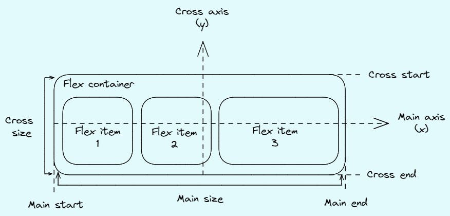
Flexbox is a module, not a single property. So, it has a lot of properties. Flexbox is divided into two parts. Flex container(parent) and flex items(child). Some properties will apply to parent elements as well as some are to child elements. Here is a block diagram of a flexbox and some discussion of its basic terms:

Main axis: The main axis is the primary axis of the flexbox, on which all the flex items are laid out. It doesn't need to always be horizontal, it depends on the flex-direction property.
Cross axis: The axis perpendicular to the main axis is called the cross axis. Its direction depends on the main axis direction.
Main start, main end: These two define the range of the main axis. From where to start align flex items and where to end.
Cross start, cross end: These two define the range of the cross axis which is perpendicular to the main axis.
Main size, cross size: The height and width of a flexbox define its size of it. Whichever is in its main dimension is known as the Main size and whichever is in the cross dimension is known as the Cross size.
Flexbox properties
Since flexbox is not a single module, it has two major components flex-container and flex-item, therefore it has two sets of properties. One set is for flex-container and the other one is for flex-items.
Flex-container properties
flex-direction
Flex-direction is used to give direction to the flexbox items according to their main axis. We can arrange the items using flex-direction in the following ways:
row(default): left to right in ltr and right to left in RTL
row-reverse: right to left in ltr and left to right in RTL
column: top to bottom
column-reverse: bottom to top
flex-wrap
Flex wrap is used to arrange all the elements inside the flex container. Otherwise, it will go outside of the container. There are three different ways of wrapping.
no-wrap(default): All flex items will reside in a single line.
wrap: It will arrange all flex items inside a container in multiple lines from top to bottom.
wrap-reverse: It will arrange all flex items inside a container in multiple lines from bottom to top.
flex-flow
This is a shorthand notation for flex-direction and flex-wrap. "flex-flow: column wrap;" this single line can align all the flex-items in column-wise and wrap as well.
justify-content
This has many uses. It works on the main axis. Justify-content allows us to place the flex-items to the flex-start, flex-end, start, end, left, right and center. It also allows us to give some spacing to the elements. Either it's evenly distributed or space-around or space-between.
flex-start: Align all the items to the start of the flexbox container.
flex-end: Align all the items to the end of the flexbox container.
start: Align all the items to the start of the writing mode direction.
end: Align all the items to the end of the writing mode direction.
left: Align all the items to the left of the flexbox container.
right: Align all the items to the right of the flexbox container.
center: Align all the items in the center of the flexbox container.
space-between: Sapces are distributed between all items except the start and end elements.
align-items
Align items aligns the flexbox container's items along with the cross-axis. It has many properties. Like, flex-start, flex-end, stretch, center etc.
flex-start/start/self-start: Place all items according to the cross-axis to the start of the flexbox container.
flex-end/end/self-end: Place all items according to the cross-axis to the end of the flexbox container.
stretch: It stretches all the items according to the flexbox container.
center: Place all the items in the center according to the cross-axis.
align-content
Align content works the same as align-items but it works on multi-line items where flex-wrap properties are set to wrap or wrap-reverse. Otherwise, it will not affect flexbox. It also has the same values as align-items and justify-content.
gap
It is used to give some spaces between flex items. The spacing is applied only between the items, not the outer edges. If there are multi-line items then this property will apply to both rows and columns. If we have to specify the gap between rows and columns then we can use row-gap and column-gap separately. For shorthand usage, we can apply "gap: 10px 20px;" like this. In that case, the row gap will be 10px and the column gap will be 20px.
Flex-items properties
order
Order property controls the order in which they appear in the flexbox. The default is 0. By giving any number in order we can re-arrange flex items.
flex-grow
It allows flex items to grow if needed. We can enlarge any flex item using flex-grow according to flex-container if that much space is available. The default value is 1. If we set the value to 2 for a particular item then it will take double the space regarding the container. We can not use negative numbers.
align-self
It allows us to play with specific items in a flexbox or a single row or column. We can adjust an item inside a column using align-self. It also has the same values as align-items.
Summary
In this article, we discussed the flexbox and some of its major properties and values. I tried to cover as much as I can and explained them with my abilities. Hope this article was helpful to you. Thank you.
Resources
https://css-tricks.com/snippets/css/a-guide-to-flexbox/
https://developer.mozilla.org/en-US/docs/Learn/CSS/CSS_layout/Flexbox
Fun activity: https://flexboxfroggy.com/